Client Project: The IGH New Build
This post has been a long time coming, as we wrapped the project back in June of this year. And although you’ve likely seen the portfolio pictures (if not, view them here) I wanted to share with you the journey.
The homeowner reached out in April of 2022. On the cusp of their design selection meeting for their new build, they wanted guidance on selections to ensure their new home would be unique, yet also timeless. So I put together a design presentation for them, talked them through my ideas, and off they went. A few months later, they reached back out, this time seeking assistance for lighting and mirror selections, as well as furnishings for their living room and dining room. With delight and excitement, phase II of the journey begins! Below highlights a few of my favorite design elements and a glimpse into what it’s like to work with us. If you have any questions on this project, feel free to drop a comment below!
Last but not least, thank you greatly for taking the time to read and for being here. Without you, this business would not work, and that’s the truth.
Color Palette
Nailing down the color palette is one of the first things I do, with any project. Why? Because the color palette is an essential aspect that contributes to the overall ambiance of a room. A harmonious blend of colors can evoke a sense of balance and tranquility. For instance, a mix of warm and cool tones can create a compelling contrast, making your space look more vibrant and lively, which is just what we wanted here.
Rug
After the color palette, usually comes the rug. And when it comes to creating a cozy and inviting space, one of the key elements to consider is a rug. It should be no surprise to you that the rug sourced was from Loloi x Amber Interiors collaboration. These rugs are known for their unique design patterns, high-quality material, and reasonable prices. They can easily become the centerpiece of your room, drawing attention and admiration.
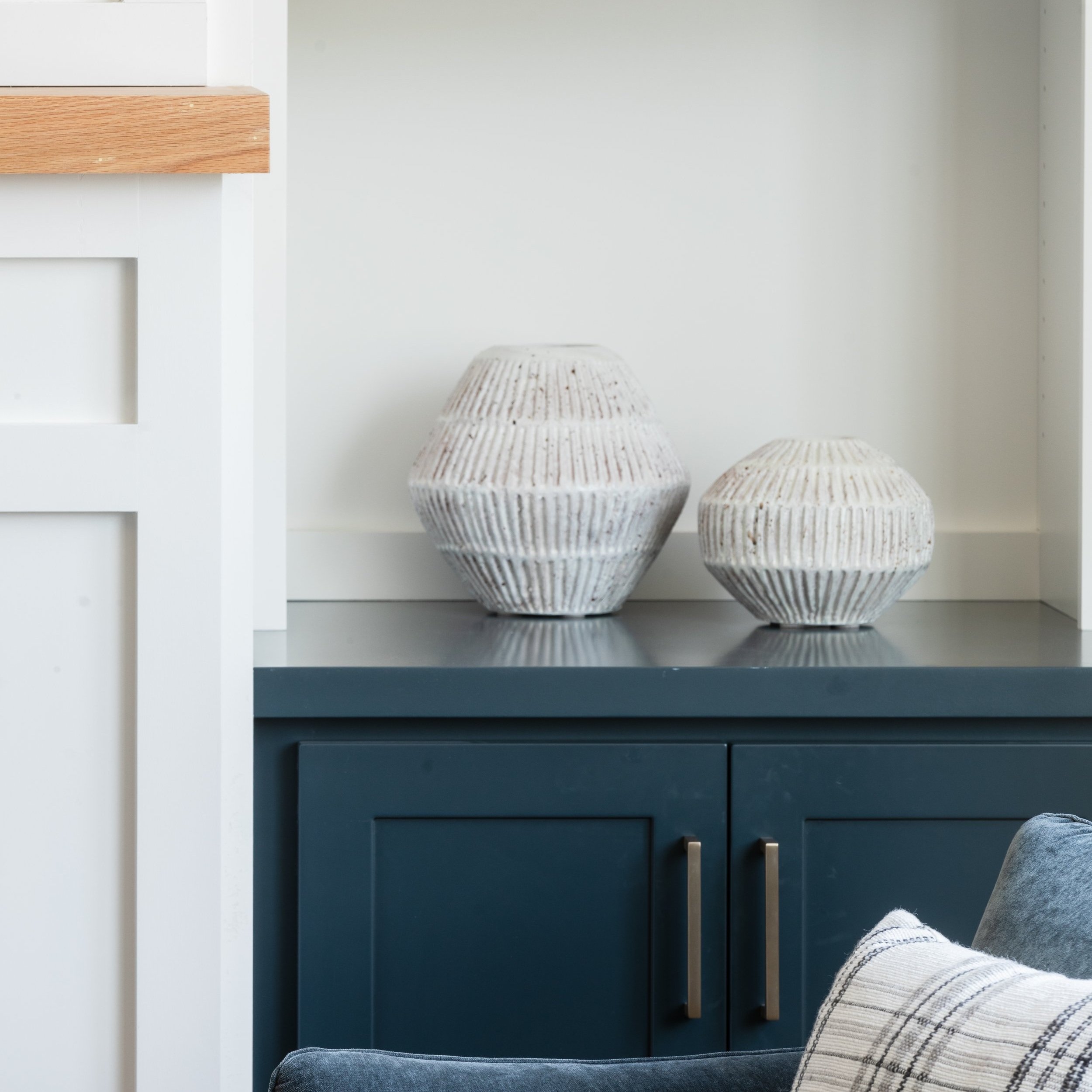
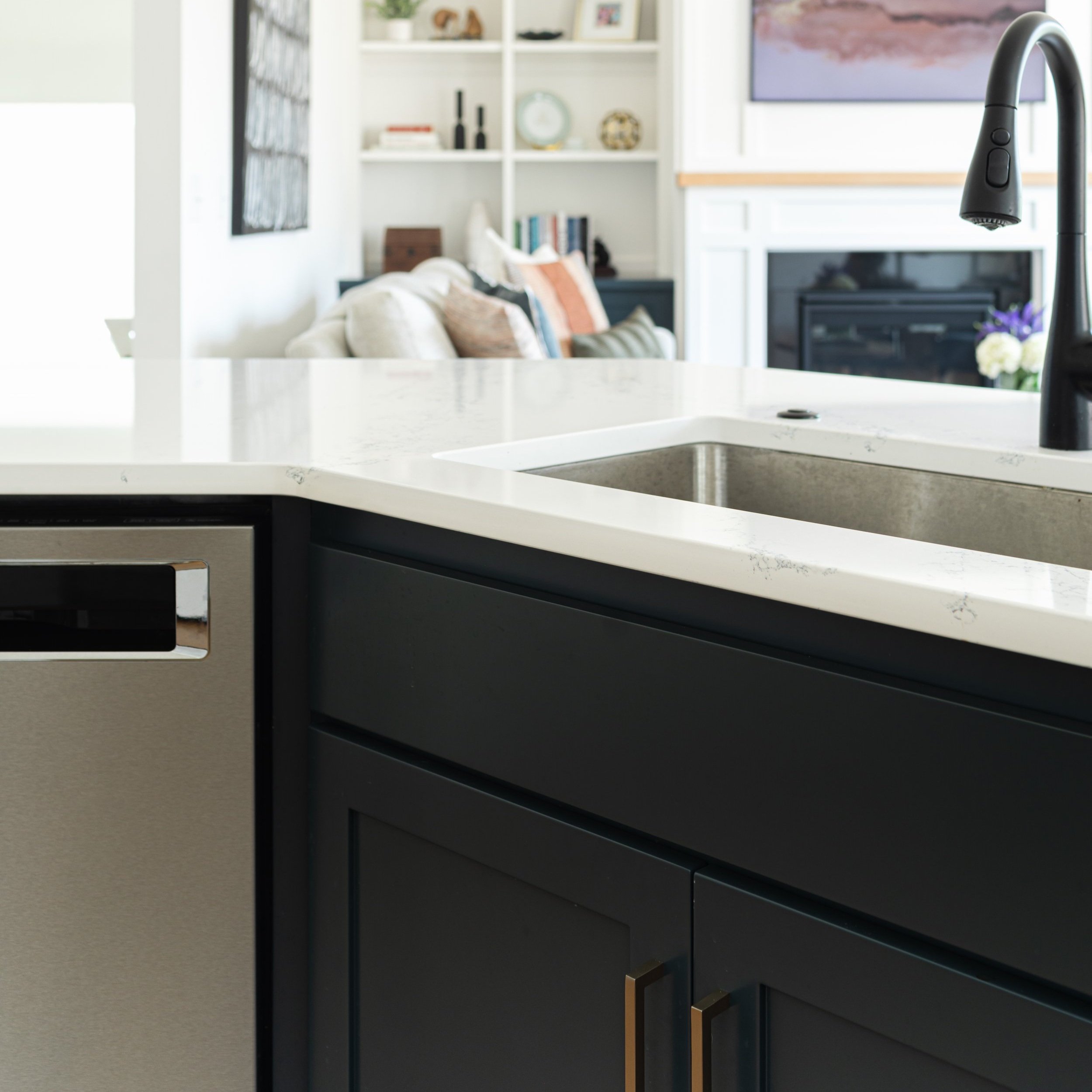
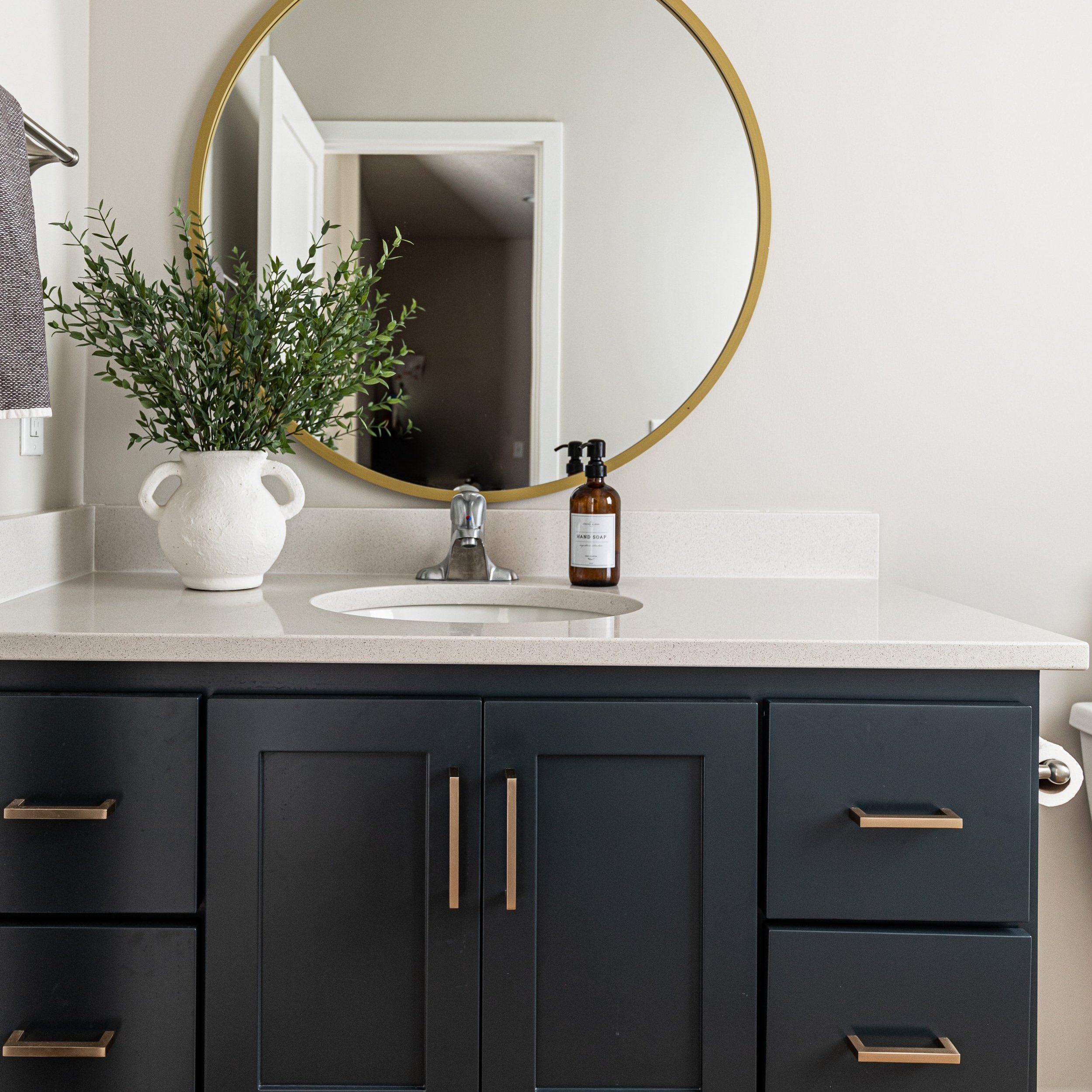
Cohesion
I talk about cohesion quite frequently because it’s the number one request from clients and in an open concept space, it is imperative. Cohesion was created a number of ways in this space, but my favorite is through the use of paint. The paint color on the island was also used on the built-ins, and in the powder bath, seamlessly tying these rooms together. And because I’m guessing you may ask, the paint color is Sherwin Williams, Mount Etna.